Responsive Grid Layout
LINQ design system defines a horizontal grid for content and UI elements to align to, creating cohesive structure with content. This responsive grid adapts to screen sizes and orientation, creating consistency across layouts.
12 Columns - Responsive
3 Columns Responsive
Complex Layout
Nested Grid
Grid
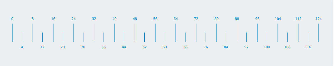
Grid systems are extremely important and allows designers to create logical guidelines to determine the relationships with in interfaces and layouts. Consistent use of the grid provides the groundwork logical ways to position elements onscreen. Designing and following a grid brings order to the page. All spacing for typography and components fits on increments of 8px. This 8px value forms the basic unit of measurement for spacing. The magic number is 8 for all of our rules. It paves a pathway for how column layouts are determined, how components connect with each other, and how elements are created. The benefit of a digital design system lies in the brilliance of the grid and its math.
Measurement
Using a baseline grid of 8px allows resilience when scaling and characterizing our spacing without overloading the system with options. By using multiples of 8 to define padding, margins of components, we make sure every element aligns to the pixel grid.
Responsive Grid Layout
Snackpaq design system defines a horizontal grid for content and UI elements to align to, creating cohesive structure with content. This responsive grid adapts to screen sizes and orientation, creating consistency across layouts.
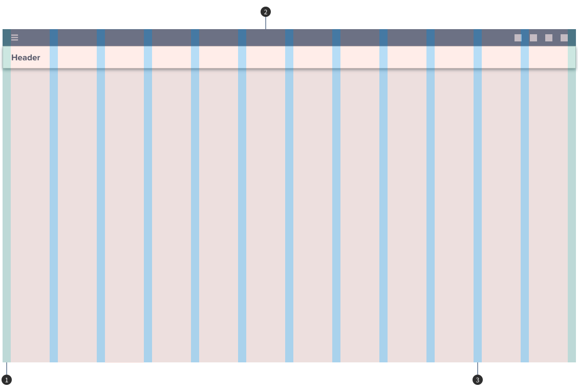
- 1. Margins: 1rem/16px
- 2. Columns: 6rem/96px
- 3. Gutters: 1rem/16px