Banners
Error and Warning Messages
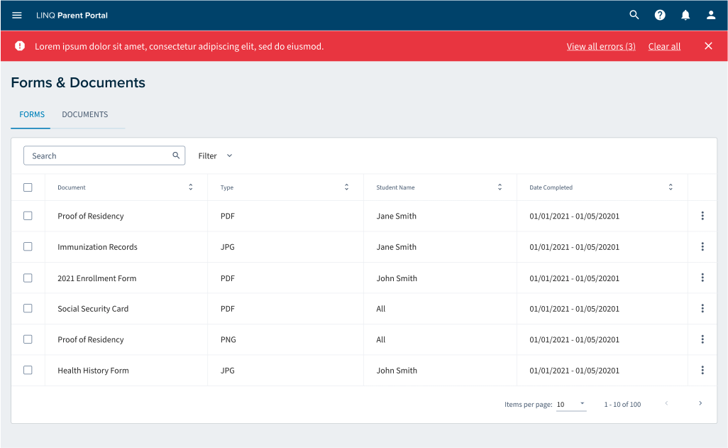
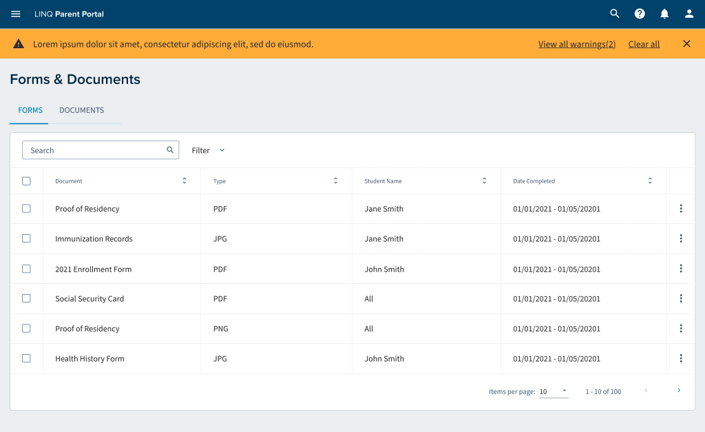
Error and warning messages should appear in a banner. In the case where there is more than one error or warning there should be a link at the end of the saying where you can click and a sheet will appear with all your messages there.
This banner will live below the global header
Usage
When there is more than 1 error or warning messages text will appear next to the warning with a link guiding you to all of your warning or error messages. If you only have one error or warning message you will see the message and be able to dismiss it
Card
Cards are surfaces that display content and actions. They should be easy to read. Elements such as, text and images, should be placed on them in a way that has good hierarchy.
Do’s
- On desktop, card content can expand and scroll within the card
- When tabbing through the cards the area is focused before moving to the next card
- The card container is the only required element in the card, all other actions are optional
- Buttons or anything actionable is placed at the bottom
- Expand card to reveal information
- More than two buttons goes in an overflow menu at the bottom
Don’ts
- mobile, card content can’t scroll but it can expand
- Don’t overload cards with extraneous information or actions
- If using dividers don’t have them run the full length of the card
- Don’t flip card to reveal information
- Don’t put more than two buttons on the card
Base Card
Empty, no extra styles - .linq-card-base
The base card class has no padding. Child elements inside the card are padded. The base card is just the outline, box-shadow and background color.
The base card class should used when the layout only requires the proper
outline, box-shadow and border.
Use
.linq-card
the majority of the time.
Card Header
.linq-card__header
The card header consist of styles which align button actions with the main title. The card header does not have rounded corners, the parent card handles the rounded corners.
Class List
.linq-card__card-header- background colors and padding.card-header- layout control.card-header__primary-actions- alignment for actions next to title.card-header__secondary-actions- alignment for actions not next to title
Example of a card header
Card Header with primary and secondary actions
Example of a card header
Card Header inside a Card
H3 Title Example
H4 Title Example
Profile Card
Multiple Selectors
.linq-card
or
.mat-card
The profile card calls out key information about a user and showcases the user's image. In the example below the profile card does not have any more styles.
Jane Doe
Profile Card with More Info
The example below has extra information, but the extra information styles are not part of the profile card styles. The extra information is using key/value classes, not profile card specific class names.
Kitty McCatterson
Profile Card Full Design
Nicolas Cage
Profile Cards in Grid
By design Cards, like (almost) all components, do not have a set width. The width must be set by the parent container
Kitty McCatterson
Primary Card
AKA Heading Card
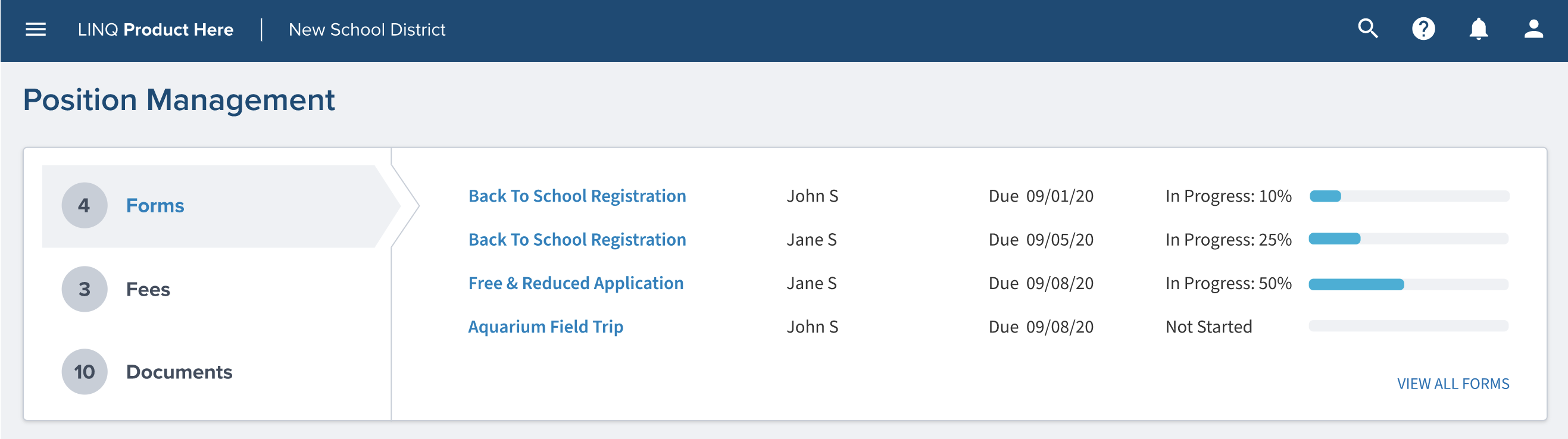
The heading card contains details about the heading, this could be details about their position. This card contains details about a grouped subject. This will be used when you can’t edit the fields right on that same page with the slide out panel.
Primary Card and Card Header
H4 Title Example
Card Details
A Card can contain many different types of data. Building out multiple classes to handle all the use cases is not maintainable. A better solution is to build a few utility classes for spacing, colors and layout.
Card Spacing Example
Welcome to a card which only contains text. The spacing is rendered
using the class
.linq-card__space. The space class is a utility to provide
common spacing for any details inside of the card body.
Card Key Value List
The example below is rendered using
.linq-key-value-list. The key value list class has nothing to
do with the card and can be used anywhere. The list uses flexbox and will
display overflow items under each other to support multiple viewport sizes.
Card Spacing Example
Card with Actions
Card actions is a utility class which creates space and aligns buttons. A
div
element is required to align the button actions. A single
div
will align all items on the right. Two
div
elements will align the first items on the left and the second elements on
the right.
I take action!
A card using the .linq-card__actions class.
Multiple types of actions
A card using the
.linq-card__actions
class and two div child elements.
Checkbox
A checkbox is a square button with a check inside to show the current state. Checkboxes allow the user to select more than one item from a set. Checkboxes can be used to turn on and off options. Unlike like radio buttons, the user is allowed to choose more than one option.
Selected
Unselected
Usage
Use when selecting multiple options
School Level
School Level *
School Level
Middle School, Elementary School
School Level *
Middle School, Elementary School
Input Chips
Input chips represent convoluted piece of information in a compact form, such as an item (person, place, or thing) or text. They allow user input and verify that input by placing it into chips. Input chips can also provide suggested responses.
Usage
Cards are surfaces that display content and actions. They should be easy to read. Elements such as, text and images, should be placed on them in a way that has good hierarchy.
Dialogs
Dialogs advise users about a task and can control critical information,
enforce decisions, or involve multiple tasks. Dialogs should be used for
errors that block app’s normal operations and important information that
requires definite user tasks, deacons, and acknowledgments.
Dialog with content overflow scroll
Heading H3
Lorem ipsum dolor sit amet, consectetur adipiscing elit, sed do eiusmod tempor incididunt ut labore et dolore magna aliqua. Ut enim ad minim veniam, quis nostrud exercitation ullamco laboris nisi ut aliquip ex ea commodo consequat. Duis aute irure dolor in reprehenderit in voluptate velit esse cillum dolore eu fugiat nulla pariatur. Excepteur sint occaecat cupidatat non proident, sunt in culpa qui officia deserunt mollit anim id est laborum.
Lorem ipsum dolor sit amet, consectetur adipiscing elit, sed do eiusmod tempor incididunt ut labore et dolore magna aliqua. Ut enim ad minim veniam, quis nostrud exercitation ullamco laboris nisi ut aliquip ex ea commodo consequat. Duis aute irure dolor in reprehenderit in voluptate velit esse cillum dolore eu fugiat nulla pariatur. Excepteur sint occaecat cupidatat non proident, sunt in culpa qui officia deserunt mollit anim id est laborum.
Lorem ipsum dolor sit amet, consectetur adipiscing elit, sed do eiusmod tempor incididunt ut labore et dolore magna aliqua. Ut enim ad minim veniam, quis nostrud exercitation ullamco laboris nisi ut aliquip ex ea commodo consequat. Duis aute irure dolor in reprehenderit in voluptate velit esse cillum dolore eu fugiat nulla pariatur. Excepteur sint occaecat cupidatat non proident, sunt in culpa qui officia deserunt mollit anim id est laborum.
Dialog Semantic States
Whoa buddy
You are about to make a huge mistake!
Heads up
Are you sure about that?
Car Warranty
Dividers
Dividers provide a visual cue between sections on a page. Using the class
.linq-divider
will style the color and spacing for an
hr
tag.
Elevation
Elevation is corresponding distance between two surfaces along the x-axis. Elevation is measured as the distance between surfaces, this allows surfaces to move in front of and behind other surfaces, showing dimension between buttons and cards, and focuses attention on components or text that appear in front of other surfaces.
Component Elevation Values
- Navigation: 12dp
- Menus, Selects, and Filters on table: 4dp
- Card: 2dp
- Button: 6dp
- Dialog: 24dp
- Calendar Objects:
Global Header
Global Header
The global header is one of the most important components for our systems. This component is a platform that spans to all parts of the UI. The functionality in the header component is applicable across all products in EMS LINQ.
Iconography
Icons
Snaqpaq icons should be used in a calculated matter to magnify comprehension and reduce thought when you need to focus on a particular action, command, or section. Do not use them if you’re unsure of the icon’s use, it’s probably not needed.
Our icons are deeply thought about with our brand and personality behind it, intended to create more functionality.
Icons should be used with essential text to support users path through the product in an accessible manner. Combining foreign icons with text could confuse users depending on how they recognized the supporting icon and the text label together. To make sure everything is compliant please keep in mind of the Web Content Accessibility Guidelines (WCAG) 2.1 AA standard color contrast ratio.
Icon shapes are from Font Awesome and they are used solid in weight.
Use the solid font weight for Font Awesome.
Use the light font weight for Font Awesome.
Avoid using icons for decoration or visual liking as it distracts from their intention elsewhere. Think about the surrounding context of icons too; if icons are crowded and not spaced well, it can lead to more visual noise and confusion.
Use a single icon for clarity.
Don’t use too many icons in UI to create visual noise.
We use Font Awesome icons that have options under it with a certain hover cover color behind it. When combined with this color there’s only one option we use to make sure everything is under ADA compliancy.
Use G10 for icons that have hovering as an option
Use any color besides G10 when hovering is an option
Icon sizes
Icons look best at 16x16, 48x48, 96x96 pixel size in the UI of LINQ products. Fluent UI administers these icons in Font Awesome where you can download the font from their website. You can change the font size based on our 8px grid.
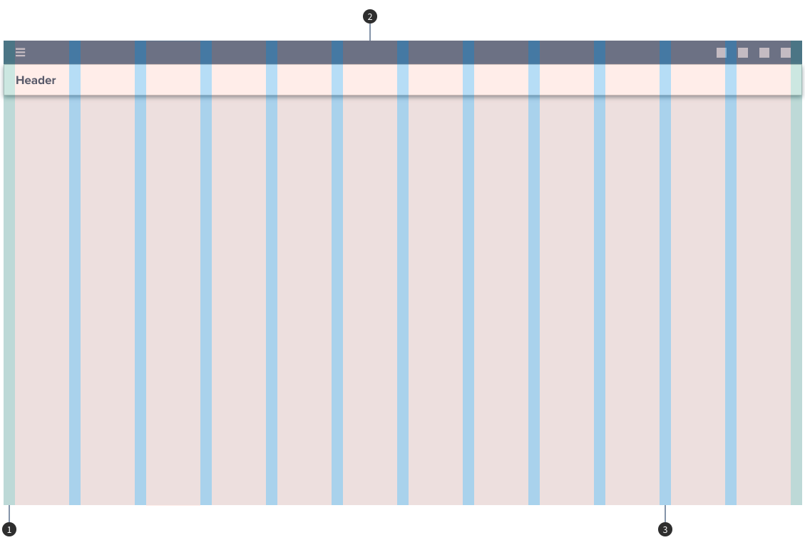
Responsive Grid Layout
LINQ design system defines a horizontal grid for content and UI elements to align to, creating cohesive structure with content. This responsive grid adapts to screen sizes and orientation, creating consistency across layouts.
12 Columns - Responsive
3 Columns Responsive
Complex Layout
Nested Grid
Grid
Grid systems are extremely important and allows designers to create logical guidelines to determine the relationships with in interfaces and layouts. Consistent use of the grid provides the groundwork logical ways to position elements onscreen. Designing and following a grid brings order to the page. All spacing for typography and components fits on increments of 8px. This 8px value forms the basic unit of measurement for spacing. The magic number is 8 for all of our rules. It paves a pathway for how column layouts are determined, how components connect with each other, and how elements are created. The benefit of a digital design system lies in the brilliance of the grid and its math.
Measurement
Using a baseline grid of 8px allows resilience when scaling and characterizing our spacing without overloading the system with options. By using multiples of 8 to define padding, margins of components, we make sure every element aligns to the pixel grid.
Responsive Grid Layout
Snackpaq design system defines a horizontal grid for content and UI elements to align to, creating cohesive structure with content. This responsive grid adapts to screen sizes and orientation, creating consistency across layouts.
- 1. Margins: 1rem/16px
- 2. Columns: 6rem/96px
- 3. Gutters: 1rem/16px
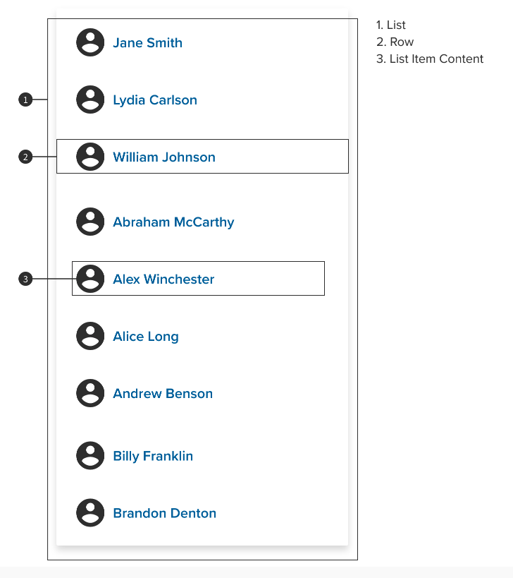
List
Anatomy
Lists are optimized for reading comprehension. A list consists of a single continuous column of subdivisions called rows that contain items of content.
Content Types
Content types can take different forms, depending on the needs of a list. A list control can display information and actions for list items.
- Supporting visuals
- Primary text
- List control (form controls, drag and drop/reordering, etc)
List Examples
The following list examples of for Material web components. Angular Material list examples can be found on the Angular playground.
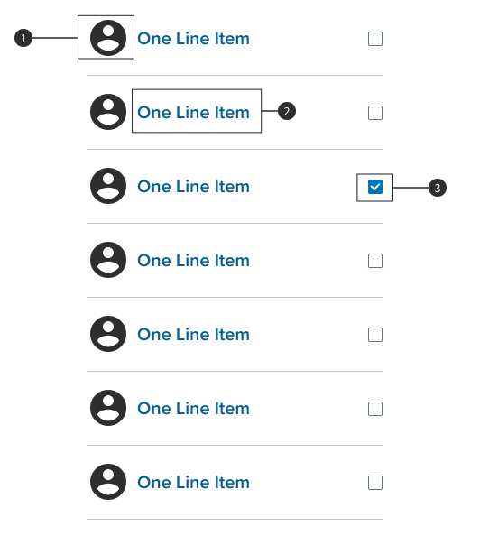
Single line list without primary, secondary or tertiary classes
- line item
- line item
- line item
Single line list with primary class
- Primary Line Example
- Primary Line Example
- Primary Line Example
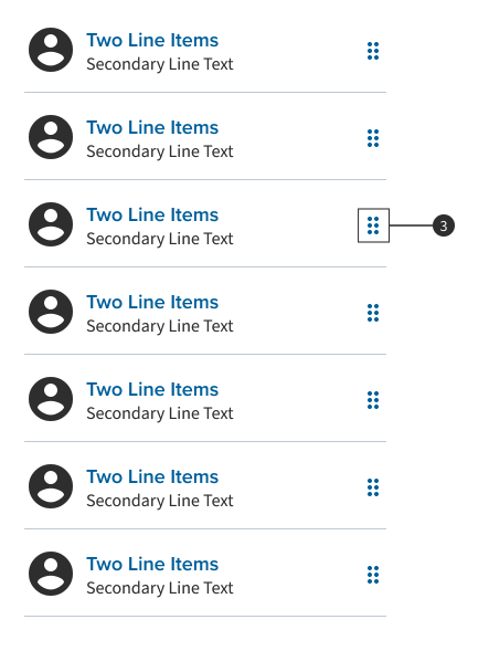
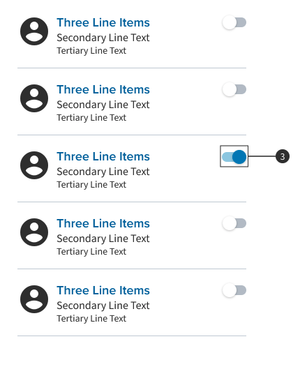
Multiline list with primary, secondary and tertiary classes. The second item is selected using the .mdc-list-item--selected class.
- Primary Line Example Secondary Line Example Tertiary Line Example
- Primary Line Example Secondary Line Example Tertiary Line Example
- Primary Line Example Secondary Line Example Tertiary Line Example
Multiline list with primary, secondary and tertiary classes and a graphic on the left.
-
Primary Line Example Secondary Line Example Tertiary Line Example
-
Primary Line Example Secondary Line Example Tertiary Line Example
-
Primary Line Example Secondary Line Example Tertiary Line Example
Multiline list with a primary action, secondary and tertiary classes and a graphic on the left.
-
Primary Line Example Secondary Line Example Tertiary Line Example
-
Primary Line Example Secondary Line Example Tertiary Line Example
-
Primary Line Example Secondary Line Example Tertiary Line Example
Single line list using the .mdc-list-item__meta class to add a checkbox on the right.
-
line item
-
line item
-
line item
Linear Progress Indicator
Linear progress indicators are made of two mandatory elements; the first one being the track, which sets boundaries for indicators to travel along; the second element being an indicator which animates along the length of the track. Linear progress indicators show development by animating a gauge along the length of the fixed visible track.
Usage
Dividers separate content into clear groups.
Snackbar
Snackbars is a service for displays messages for notifications. These are contextual and are placed in the most suitable area of the UI
Snackbar – text only
Informational .linq-snackbar--info
Success .linq-snackbar--success
Snackbar – with action
Informational .linq-snackbar--info
Success .linq-snackbar--success
Usage
Snackbars inform users of a process that an app has performed or will perform. They appear temporarily, towards the bottom of the screen. They shouldn’t interrupt the user experience. Snackbars should be 40 pixels from the top.
Switches
A switch defines a button with two states, on and off. Toggle switches allow users to choose between two options, and the one option should always enable by default.
The table is in alpha and currently being develop! Not ready for production! Do not use!
Table
Use the options below to toggle table variants.
| Generating Random Data... |
Fixed Tabs
Fixed tabs are used to separate content into thought out, related sections. Fixed tabs allow users to focus on one specific view at a time while to continue the sight of all relevant content options available. Each tab when chosen will show its own content.
Usage
Fixed tabs are to organize and allow navigation between groups of content that are related at the same level of hierarchy
Text Fields
A text field is an input that will allow a user to write or edit any text from the field. Filled text fields have more visual priority than outlined text fields, they stand out more when they are enclosed by other content and components.
Inactive
Required
Disabled
Hover
Activated
Focused
Help Text
Error
Read Only
Usage
Dropdown menus display a list of options, generated by an icon, button, or action. The placement varies based on the element that opens them.
Add Pickup Location
Tooltip
Tooltips provides a text label that is displayed when the user hovers over or longpresses an element. When using an icon there is no spacing required between the icon and the tooltip
Tooltip positioning is based on the anchor element. The position will change based on the available space.
Angular Material tooltips have a position option.
Usage
When activated, tooltips display a text label identifying an element, such as a description of its function.